How to Create a Power BI Dashboard
Published On: August 4, 2022
Businesses today rely heavily on data to make informed decisions, and simply collecting data is no longer enough. The real value comes from how effectively that data is analysed and presented. This is where tools like Power BI become essential.
Power BI allows organisations to turn raw data into clear, interactive dashboards that help teams monitor performance, identify trends, and make faster decisions. In this guide, you will learn how to create a Power BI dashboard, along with practical use cases and best practices used in real business environments.
Power BI is a business intelligence tool developed by Microsoft that helps organisations collect, analyse, and visualise data in a meaningful way. It allows users to transform complex datasets into interactive dashboards that support faster and more accurate decision-making.
There are two variations of Power BI: Power BI Desktop and Power BI Service.
This article explains how to create a Power BI dashboard, as well as popular use cases and best practices. We also answer the question of whether an Excel or SQL dashboard can be created.
What is a Power BI Dashboard
A Power BI dashboard is a single-page visual interface designed to display key business metrics using charts, graphs, and other visual elements. It provides a high-level overview of important data, allowing users to quickly understand performance without going through detailed reports.
Unlike reports, dashboards focus on summarising the most critical information in one place, making them ideal for monitoring business activities such as sales, finance, or operations.
It is important to note that Power BI dashboards are created in Power BI Service by pinning visuals from reports, while reports themselves are typically built in Power BI Desktop.
Power BI Dashboard vs Report
Power BI dashboards and reports are often confused, but they serve different purposes. A dashboard is a single-page view that shows key metrics at a glance, while a report contains multiple pages with detailed data analysis. Dashboards are mainly used for monitoring performance, whereas reports are used for deeper exploration of data.
How to Create a Power BI Dashboard
Creating a Power BI dashboard typically involves building a report first and then pinning important visuals to a dashboard in Power BI Service. This approach ensures that your dashboard displays only the most relevant insights for quick decision-making.
It should be noted that Power BI dashboards are a capability that is exclusive to the Power BI Service and are not offered by Power BI Desktop. Dashboards cannot be created on a mobile device, but you can view or share dashboards. An example of a Power BI dashboard for a sales and marketing organisation is given below.

So, A Power BI dashboard is distinct from Power BI reports. A dashboard is a collection of visuals that employ graphs or charts to deliver a story to the user.
1. Choose and Prepare Your Data Source
Before importing data, it is important to ensure that your dataset is clean, well-structured, and aligned with your business goals. Poor data quality can lead to misleading dashboards.
You want to represent once you’ve created a Power BI Service account, choose the single data collection.
1. On the Home screen’s lower left corner, click the Get Data icon.
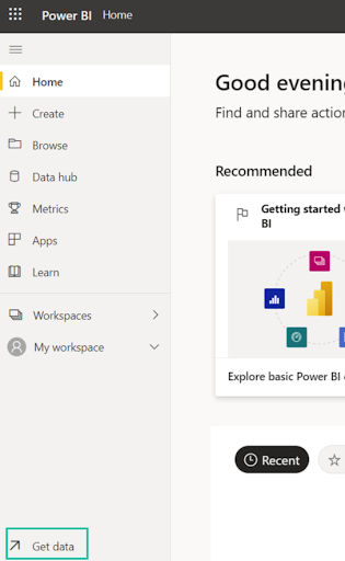
2. Click Get in the Files section.

3. Select Local File and choose a file (e.g., an Excel file).

4. After selecting the file, select Import.

5. Your file name should show on this screen.

6. After the process is done, your data set will show up on the Home screen’s recent list. The same thing is also accessible via the My workspace screen.

2. Select the data sources
Choosing the right data source depends on your business needs. Excel is suitable for smaller datasets, while SQL databases are better for handling large and frequently updated data. Cloud-based sources offer better scalability and real-time access.
Power BI Service lets you connect to data from multiple sources, with Azure SQL Database, Azure Synapse Analytics (formerly SQL Data Warehouse), and Spark on Azure HDInsight being the most common.
To connect, you must utilise Power BI Desktop or Excel, query, and load data into a data model. Following that, you may import your file into Power BI, which already has a data set.
Refer to the entire list of data sources.
1. Select the Get Data button on the Home screen.

2. Under the Databases section, click the get option. Here, you can see a list of common data types.

3. Choose the right database or data source.

3. Create a data model
A strong data model improves dashboard performance and accuracy. This includes defining relationships between tables, creating calculated measures, and organising data into logical structures
1. Click Create on the Home screen to start creating a data model.

2. You’ll have two options: Choosing a public dataset or pasting or manually entering data. Choose the option that suits you.

4. Establish relationships between tables
In most cases, relationships should follow a one-to-many structure. Incorrect relationships can produce inaccurate results, so it is important to validate them before building visuals.
Through its autodetect capability, Power BI automatically creates associations between tables. If you need to establish a relationship yourself, you might have to accomplish this manually.
Power BI won’t automatically create a relationship between two tables if it can’t determine with sufficient assurance that such a link should exist.
Autodetect
- Navigate to the Modelling tab
- Click on Manage relationships
- Select Autodetect
- Close the dialogue box
Manually
1. Repeat step 1 above, but this time click New rather than Autodetect to bring up the Create Relationship dialogue box.
2. Select the first table on the drop-down list and the column you want to use.
3. Select the other table you wish to build a relationship with from the second table drop-down list.
4. Now, select the requisite column.
5. Once done, click OK.
5. Visualise the data
Selecting the right visualisation is essential for clear communication. For example, bar charts are ideal for comparisons, line charts for trends, and cards for displaying key performance indicators. Using the wrong visual can make data harder to interpret.
1. Go to My workplace, then click Edit to visit your dashboard.

2. There are many different charts, maps, and tables to pick from under Visualisations.

Simple line charts, area charts, and pie charts are just a few of the standard data visualisation elements that Power BI includes. It also includes more intricate models like funnels, waterfalls, gauges, maps, and more. So, drop and drag the visuals from the right sidebar to the axis.
6. Design the Power BI Dashboard
An effective dashboard should present information clearly and quickly. Focus on key metrics instead of adding too many visuals. Use consistent colours, proper spacing, and logical arrangement to improve readability and user experience.
A Power BI dashboard is a one-page canvas that tells a story using visualisations. It can only fit on one page because it only includes the most important parts of a story.
Colours, text, images, media, and unique measurements are all crucial factors to take into account when designing a dashboard to ensure that the important components of the story are effectively conveyed.
You can add a dashboard theme using this step.
1. Click Edit on your dashboard under My workspace. Click on the Dashboard theme.

2. You will now see a dashboard pane. Select one of the pre-built themes. For instance, light, dark, or specially created themes.

3. From the drop-down menu, choose Custom to create a custom theme.

If you actually plan to add a background image, make sure it has a resolution of at least 1920×1080. You can post an image to a public website and use it as the background. Finally, copy the image’s URL and put it in the section labelled “Image URL.”
By submitting a JSON file that contains settings for all the colours you want to have in your dashboard, you can create a custom theme in a second way.
You can submit these same JSON files for dashboards in the same way that Power BI Desktop users can use them to generate themes in their reports.
A Theme Gallery Page for the Power BI community allows users to browse and upload JSON files.
To contribute pictures, text, and videos, follow these instructions.
1. Click on + Add a tile.

2. Next, add your preferred media.

Typical Power BI dashboard use cases
Power BI dashboards are widely used across different business functions. Each type of dashboard is designed to answer specific questions and support decision-making.
Importantly, the HR analytics dashboard.
Typical Power BI Dashboard Use Cases
In real business scenarios, Power BI dashboards are used to simplify complex data and make everyday decision-making easier. Instead of going through large spreadsheets or multiple reports, teams can quickly view the most important information in one place. Below are some of the most practical ways businesses use Power BI dashboards.
HR Analytics Dashboard
An HR dashboard helps teams keep track of workforce data without digging through multiple files. It can show total employees, new hires, attrition rates, and performance across departments. This makes it easier for HR managers to spot hiring trends, identify retention issues, and plan workforce strategies more effectively.
Sales Scorecard Dashboard
Sales teams often deal with large volumes of data, which can be difficult to analyse manually. A sales dashboard brings everything together in a clear format—revenue, targets, top-performing products, and regional performance. This helps managers quickly understand what’s working and where improvements are needed.
Social Media Monitoring Dashboard
For marketing teams, tracking performance across different platforms can be overwhelming. A social media dashboard combines key metrics like impressions, engagement, clicks, and follower growth in one place. It helps teams understand which campaigns are performing well and where adjustments are needed.
Financial Reporting Dashboard
Financial data is often stored in detailed spreadsheets, which can take time to review. A Power BI dashboard simplifies this by presenting revenue, expenses, and profit metrics visually. This allows business leaders to quickly understand financial performance and make timely decisions.
Team Performance Dashboard
Tracking team performance becomes much easier with a dashboard. Managers can monitor productivity, progress toward goals, and overall performance in real time. This helps in identifying strong performers as well as areas where additional support may be needed.
Inventory Management Dashboard
For businesses that manage physical products, inventory tracking is critical. A dashboard can display stock levels, product movement, and reorder points. This helps prevent stock shortages and overstocking, ensuring smoother operations.
Power BI dashboard examples
The following examples show how Power BI dashboards are used in real business scenarios to support data-driven decisions.
1. Customer Profitability Dashboard
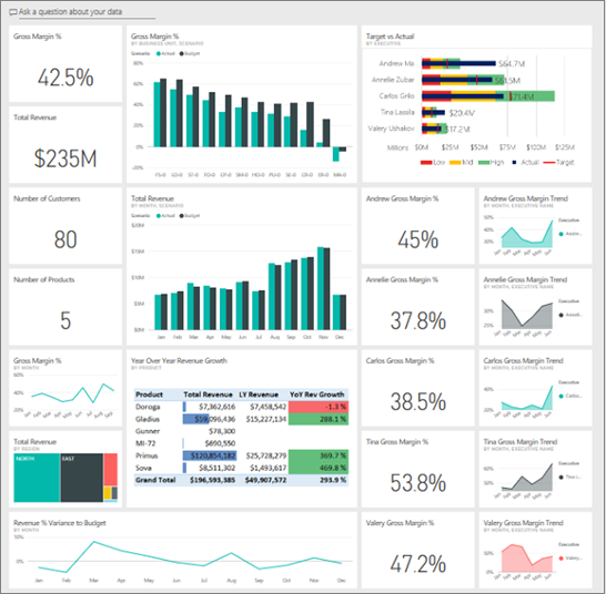
Firstly, an executive’s key metrics regarding the company’s executives, products, and customers are examined by a CFO using a customer profitability dashboard.
By examining crucial parameters like the number of clients, the number of goods, the gross margin, and the overall income, this dashboard delves deeply into the profitability of a business. So, get a Customer Profitability Dashboard here.
2. Sales and Marketing Dashboard

Secondly, this dashboard makes it easier to comprehend a company’s market share, product volume, sales, and industry sentiment. Click here to see the Sales and Marketing Dashboard.
3. Human Resources Dashboard

The human resource dashboard assists in providing data on recent hiring, working staff, and departing personnel. Additionally, you gain a thorough insight into who is hired, identify any biases in your hiring process, and obtain current data on voluntary separations. So, get a Human Resources Dashboard here.
4. Retail Analysis Dashboard
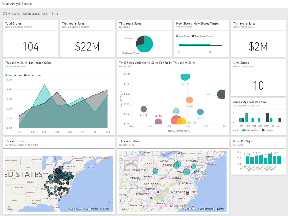
Also, you can use this dashboard to compare the performance of the current year to the previous one. Receive data about sales, variance, gross margin, and new store analysis. Get a Retail Analysis Dashboard here.
5. Procurement Analysis Dashboard

Finally, this is a fantastic dashboard illustration for a manufacturer. It aids in the categorisation of vendor spending by geography and category. So, find out which top merchants offer the biggest discounts, total invoices, and other information. Get a Procurement Analysis Dashboard here.
Can SQL or Excel be used to create a Power BI dashboard?
Yes, you can create a Power BI dashboard using SQL or Excel.
You must select the Home tab, then click Get Data > SQL Server, to access SQL. For a comprehensive understanding, consult this tutorial.
You must create data in Excel, download sample data, construct a report in Power BI, and pin the report’s graphics to a dashboard to use in Excel. Above all, for more details, please refer to this article.
Power BI dashboard: Best practices
We’ve answered the question, “What is Power BI?” It’s time to maximise the use of your Power BI dashboard at this point. Consider some best practices.
Power BI Dashboard: Best Practices
Creating a good Power BI dashboard is not just about adding charts—it’s about making the data easy to understand and useful for the people who will actually use it. A well-designed dashboard should help users quickly find answers without needing extra explanation.
Understand Your Audience
Before designing anything, think about who will be using the dashboard. A dashboard for executives will look very different from one used by analysts. Focus on what your audience needs to see first and avoid adding unnecessary details that might confuse them.
Highlight What Matters Most
Not all data points are equally important. Identify the key metrics and make sure they stand out. Power BI allows you to highlight specific visuals when needed, helping users focus on the most important insights without distraction.
Use Filters and Slicers Carefully
Slicers are a simple but powerful way to let users explore data on their own. They allow people to filter information based on categories like time, region, or product. However, too many filters can make the dashboard harder to use, so keep them relevant and easy to understand.
Keep Your Design Clean
A cluttered dashboard can make even good data difficult to read. Try to limit the number of visuals and avoid unnecessary elements. Clear spacing between charts and a simple layout will make the dashboard easier to scan.
Use Colours with Purpose
Colours should help users understand the data, not distract them. Use a consistent colour scheme and assign meaning to colours—for example, green for positive performance and red for negative trends. This makes the dashboard more intuitive.
Organise Content Logically
Place your most important information at the top or in the most visible area. Group related visuals together so users can follow the story without jumping around the screen. A clear structure helps users move from summary insights to more detailed data naturally.
Think About How People Read the Dashboard
Users don’t study dashboards—they scan them. Arrange your visuals in a way that follows a natural reading pattern, usually from left to right and top to bottom. This helps users understand the information quickly without feeling overwhelmed.
Working as a Power BI specialist
Power BI services are in demand because more and more businesses are realising the potential of big data processing to offer insightful information and support smart decisions.
Ready for
Digital Transformation?


